Mercator Classic: The Story Behind Our Best-Selling Wallpaper
Why Mercator Classic looks the way it does, what changed during development, and what almost didn't make it into the final version.
Mercator Chronos is the clock wallpaper I get the most "how did you make this" messages about, and the honest answer is: badly, for a while, before it was good.
What it started as
The first version was a rotating 3D globe. Sounds obvious in hindsight — "Mercator" in the name, do a globe — but it was wrong for a desktop wallpaper for a reason I didn't see coming: a rotating sphere has a moving focal point. Your eye tracks it. That's exactly what you don't want behind a desktop full of icons and windows — it competes for attention instead of sitting quietly underneath everything.
I scrapped the 3D globe after about a week of work on it. Not a fun call to make, but the thing was actively worse to live with than no wallpaper at all.
What actually shipped
The version people buy is a flattened Mercator-style projection — the world map you know from classrooms — with slow, continuous drift across the landmasses and a subtle lighting pass that shifts over a long cycle rather than looping obviously. No spinning object, no single point your eye locks onto. It reads as ambient rather than as an animation you're watching.
The trick that made it work was slowing everything down by roughly 4x from my first pass. My instinct kept pushing it faster because faster felt more impressive in a 10-second demo clip. But a wallpaper isn't a demo clip — you live with it for hours, and what feels flat in a screen recording is exactly right at your desk. Slow enough that you'd have to stare at it for a full minute to notice it had moved at all.
What I'd still change
The color grading skews slightly cooler than I'd choose today — a decision made early and never revisited because by the time I noticed, it was already the version everyone recognized. Changing it now would mean changing the identity of the best-selling thing in the catalogue, which is a worse trade than living with a color choice I'd make differently in a vacuum.
Why it sells
My honest read: it doesn't look like a "wallpaper app" wallpaper. No particles, no neon, nothing trying to prove it's dynamic. It looks like a print you'd frame, that happens to move. That restraint was the actual design decision — everything else was just getting the technical execution out of the way of it.
More build stories like this one: how I got a particle flow field to run at near-zero CPU.
Browse the full catalogue here.
Mercator Chronos
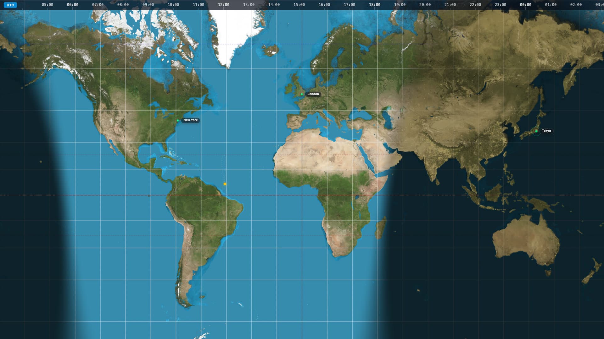
Transform your desktop into a live, global command centre with Mercator Chronos. This dynamic wallpaper brings the Earth’s natural day-night cycle directly to your screen in a stunning, high-definition cylindrical projection. As time passes, the dynamic terminator shadow sweeps across the map, plunging regions into beautifully rendered nightscapes illuminated by glowing city lights. Whether you use it to track time zones, monitor global events, or simply enjoy a highly functional and data-rich aesthetic, this wallpaper provides a sophisticated, constantly evolving backdrop.
Run this as a live wallpaper with Novaframe
Novaframe is the free desktop engine behind these wallpapers — real-time shaders rendered on your GPU, not video loops. Download it once, then apply anything from the catalogue in one click.
Frequently asked questions
Related articles
Voronoi Drift: How Computational Geometry Becomes a Living Wallpaper
A Voronoi diagram answers one question: which point are you closest to? Ask it a few thousand times per second with moving seeds and you get something that looks alive.
4 min readPhysarum Slime Mold: The Living Network Growing on Your Desktop
Slime mold is one of the most fascinating organisms alive. It has no brain, no neurons, no plan — and it still finds the shortest path. Here's how I put that on your desktop.
4 min readSilk Aurora: What It Takes to Make Light Feel Like Liquid on a Desktop
Silk Aurora's ribbons of teal and violet never tear, never z-fight, and never repeat. Here's how a single 2D fragment pass pulls that off.
4 min read